Every Melbourne suburb, scored from timetable data
How good is public transport at your address?
We scored every stop in Melbourne from 0 to 100 on frequency, coverage, and reliability, direct from the published PTV timetable. Enter your suburb. The score explains your weekly commute.
Addresses are geocoded in your browser and never stored. Address search by OpenStreetMap Nominatim.
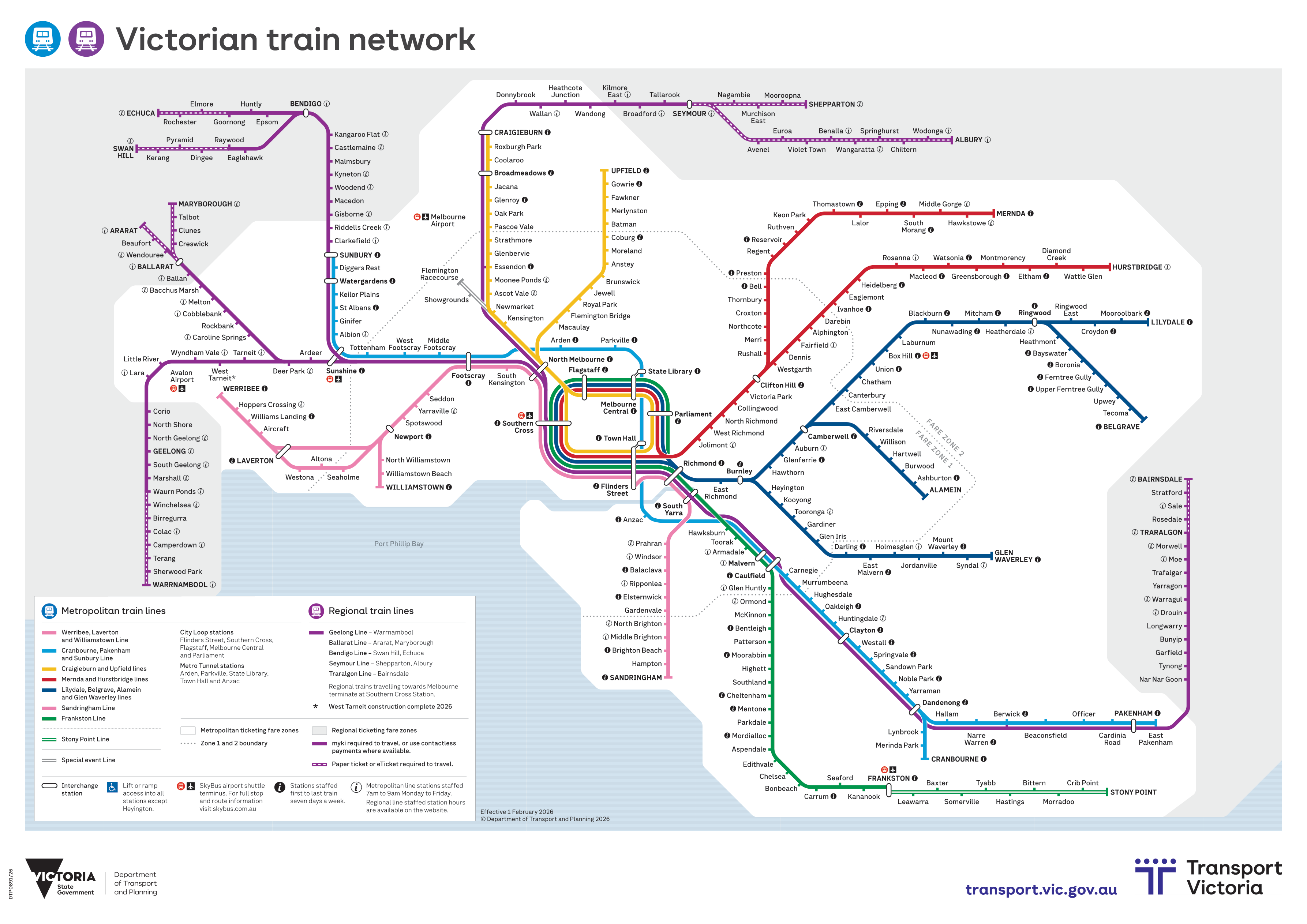
OFFICIAL MAPVictorian Train Network
VIEW MAP
#1 worst served
Avalon
0/100
#2 worst served
Deanside
0/100
#3 worst served
Pakenham Upper
4/100
The numbers behind the anger
Running a car costs an average of $15,000 a year. In the worst-served suburbs, the timetable makes that cost compulsory. Every score on this site traces back to published data on the methodology page.
See the 20 worst served suburbs